Tuesday 22 March 2011

Moviestorm Session 1


in our first moviestorm session we assigned ourselves our roles. I will be in charge of designing the set for our movie, my partners Kristie and Jack will be in charge of designing characters, sound and scripts. We do not have much dialogue in our movie so this will probably be avoided completely.

Wednesday 26 January 2011

Session 17 & 18


In Sessions 17 & 18 we started to edit the main film onto the main editing computer. To change the visual side of editing, I used the razor tool to shorten the shots so it would increase the pace of the film so it would have a continuity flow to it. I also edited the audio where I used a L-shape edit. Towards the end of the sequence Lewis had found something on Garage Band and we used it in our own film.well with the genre of the film.
When we watched the film over again we noticed that the effect of the film wasn't very bright and we wanted to to have a bit of colour on it. I went to Effects > Video Filters > Image Control > HSV Adjust, where I then went to the filters on the video bar and I had changed the Saturation, Value and Mix.

Session 16


In session 16 we re filmed the house scene in which i would gather some stuff and leave for the train station. We booked out the video camera, stills camera and the tripod. We managed to film and be back in class to upload very shortly as the office we filmed in was opposite the class-room. When we got back to class we still had enough time to upload our footage onto our laptops and even convert it to Quicktime Movie for the big computer.

Session 15

In session 15 i helped our group 2 with some filming, i played a role in their movie and that consumed a moderate amount of time in the session, when i returned to class Kristie and myself edited the current clips that we had, knowing that we would be filming more later on we didn't completely finish the editing on Final Cut but instead made space for the upcoming footage.

Session 14

In session 14 i just did some blogs and planned the office scene for the following afternoon. We also went through our film on the big computer and thought about what exactly we needed now to finish and edit our sequence.

Session 13

In session 13 we designed 2 props, first we turned a folder into a top secret folder and then made a top secret document to go inside the folder, my face was printed on the document to add some dramatic effect. The reason the props are used in our film is to clear the main characters name.

Session 11 & 12

In session 11 and 12 me and Kristie went to cambridge train station and she recorded me walking in whilst she was recording from the round about island in the middle, it was crucial that we got the train station sign in to show it was an authentic location which would give our movie a realistic aspect.

For the final bit of session 12 we filmed the identity changing scene, this was me in the toilet at Longroad, these clips played a big role in our film. We chose to film into a mirror and have the reflection as me cutting my hair, washing my face (representing a fresh start) and putting on a new set of clothes.

Session 10

In session 10 i wasn't in college and therefore Kirstie just planned our next filming session, in session 11 we are going to film at the station and re-shoot and replace the train station clips.

Session 8 & 9


In session 8 we uploaded all of our footage onto our laptops and converted each shot to Quicktime Movie so we could use them on the Mac, we went through every shot and wrote down each shot number and said what was good and bad about the shot so when it came to putting the shots on the Final Cut timeline we could have the best possible clips and would take less time edit. Kristie and myself went through every shot and came to the conclusion that some shots would need filming again and others needed some detailed editing.

Tuesday 25 January 2011

Session 7


We were meant to film at our friends house in the session before but as we couldn't we decided to film in the office just opposite our class. We booked out a stills camera, video camera, and a tripod. For props we used the top secret folder, both the bags from the previous scene and the top secret document. I myself performed in this scene alone and my partner Kristie recorded the entire thing.

Final Video Class Feedback


Improvements:
We had a class viewing and anyone other than our own group stated some positive and negative things about our video, here are some of the statements quoted. Improvements: a different location instead of the office, the office doesn't seem very real and house-like. Blood at the scene of the murder would of been a lot more realistic and added some dramatic effect to the ending. Also Eds acting is possibly too comical and doesn't give the killing scene much sense of authentic urgency. Too conclude; the music is too loud when it starts, punching in, blending in and out.

Positive:
Point of view shot with the camera moving works really well when the gun is fired, it gives a 1st person view on the murderers activity. The two scene locations at City House entrance to the train station worked very well, they showed the characters movement and genuine escape from the city. the characters haircut really brings out effective use of character building details, as well as the wash of the face and change of clothes - it shows the viewer what exactly is going on and gives off clear proof of the fact the film is ending. The props are ideal for the film and keep sort of clears the murderers name, giving you a sense of sympathy for him, even without reading the prop file the viewers could understand what was going on.

Monday 24 January 2011

Session 6


In session 6 we started filming our interrogation scenes out the front of Longroad, Ed and myself both performed in these scenes. We used the video camera, stills camera, dolly and a tripod. The props we used were 2x bags, and a gun. Most of the shots we did were close ups of Ed being the victim of a vigilante yet vicious crime. We didn't use the dolly in the end because the concrete was too bumpy and the the film quality was poor so we resulted in the fade out shot by hand.

Session 5

In session 5 me and my partner were meant to film at one of our friends house but because of an issue with her not being able to be at home for the specific time we had to postpone the filming to next lesson in the office. We had to do another booking sheet for the following location and also had to re-draw the story board for that scene.

Sunday 23 January 2011

Session 4


In our 4th session we were given a health and safety risk assessment sheet, we had to fill in the possible risks and dangers in which we could stumble upon when filming at that certain location. We had to think about ways to avoid and minimize the chance of the risks. We filled in the sheets for the following locations; train station, disabled toilet, the office. The sheet also says the date, activity, and the location.

Session 3

Due to not being able to film in session 2 because of my delay, we chose to film in session 3. We couldn't film on a bus for health and safety reasons and the bus wouldn't of stopped for us every time we have tried to film the shots on the bus. I had a meeting with my partner and we came to the conclusion to change from bus escape scene to the train station. We booked out a video camera, tripod, and a stills camera. We have chosen to not use the dolly in this filming session to avoid health and safety issues because we were in a busy public area.

Session 2

In session 2, we planned to film in lesson 1 but there was a problem as i missed the bus so we postponed the filming to lesson 2. In this session i scheduled with my team mate when to film in the upcoming session. We booked out the equipment using the equipment booking form. We also sorted out the booklet that we will be taking to our location and to check if we have the clapper boards ready and know what scenes to film.

Wednesday 19 January 2011

Session 1

In our first session we got given an A3 sheet in which we had to plan each of the following lessons for our filming schedule over the next 2 weeks. The black text on the image is our initial idea for the scheduled lessons. More information was added once the week progressed as dilemmas arose, locations were replaced when we could not access our first filming location on the wednesday.

We filled in an equipment booking form which gives the college evidence of our use of the filming equipment. on the booking form we have to tick which item(s) we will be using for the filming session, you can tick Stills Camera, Video Camera, Tripod, and/or a Dolly.

The majority of our lessons we have team meetings where we discuss our roles in the film and brainstorm possible things we can do or add to our film. My role is editor/performer. We also talked about the props and locations we are going to use.

Wednesday 5 January 2011

Contact Sheet - Saatchi Gallery


Saatchi Gallery is located in Duke of york HQ, King's Road, Chelsea, London, SW3 4SQ, U.K, its a gallery just for contemporary art. Opened by Charles Saatchi in 1985 so he could exhibit his collection to the public.

Friday 10 December 2010

Shank


People
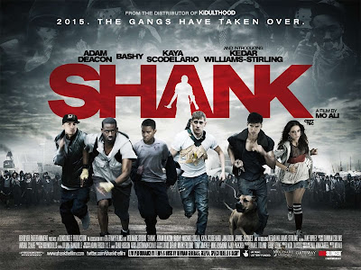
The main characters in the film are all a gang of friends in the story. they are presented as if they are being chased as in the background there are hundreds of gangs hostile or allied. the actors on the front page are known from the directors other films, for example: Adam Deacon from Kidulthood and Michael Socha who's in This is England. Also Ashley Bashy Thomas who starred in 4.3.2.1 in June 2010- he is also a famous underground grime artist. The film stars in this film give away what the film genre is about, they are presented physically and violently, the freeze frame of the characters on the poster shows the film is adrenaline packed and intense.

Design
The poster design gives a sense of anarchy, and judging by the sub-title its in the future and the world we knew is changed for worse by everyday issues we endure, such as crime and economic downfalls. Shank is an action / sci-fi and jam-packed with explosives, knives, guns and chase scenes. The abstract imagery in the background of the poster gives you ideas on how rundown and scummy the locations are in the film, this excites viewers into thinking it will be a hard film.

Colour
The colour scheme for this poster is dark and dreary, black and white imagery and blood red title to stand out. the darks colours such as grey and black give reference to run down urban background, dark, and unsafe streets. The intense red symbolizes blood and murder, which is exactly what the film evolves around.

Title
The title text is very easy to read, its bold and bright in comparison to the abstract background. The letter 'A' in the title has the shape of a knife holding male, perhaps the main characters arch enemy.

Tuesday 7 December 2010

Story Board 3

Story Board 2

Story Board

The thirteenth shot is the killer leaving the house with new clothes on and looking packed ready for a some sort of

The seventh scene is the killer re-filling the bag with the items he emptied out, possibly a longshot. the Eighth scene is the killer holding the dead person in the air, looking for a way to dispose of the body. the ninth clip is the killer putting the dead body into a bin. The tenth scene is scene is the killer leaving the scene, with the bag, and the body dealt with. the eleventh scene is the killer entering his house from a long-shot. the twelth scene is the killer packing stuff into a bag including the stolen goods and some cloths.

In the opening scene you have a close up of a gun to a victims forehead, this shot sets the mood with the victims emotions. the second scene is the same as the first but zoomed out slightly to show the location a little. the third scene is an over the shoulder shot of the person aimed the gun straight into the victims face, you can see into the gun barrel, the gun shoots and kills the person. the fourth scene is the person killed on the floor dead. the fifth scene is the murderer emptying the dead persons bag onto the floor. the sixth clip is just a short clip of all the items on the floor, so you can identify the items.


the seventh scene is

Wednesday 1 December 2010

Action Thriller Moodboard


Our task was to create a mood-board on photoshop to give us ideas for our film. All of these images are relevant for our short film sequence. I got the images from google images and flickr. On flikr i got told the creative commons which means the person that have taken the picture has certain copyright policy's.

Sunday 21 November 2010

Animatronics


Animatronics is the construction of robots to look like animals or humans, they work best in movies because they can play great parts in realistic action that does not require CGI and can be simply used in the film like a actor would be. Animatronics works well in terminator when he repairs his hand and the wires and metal are all beneath his skin, realistic and not too advanced.

Green/Blue Screen


Chroma key compositing (or Green Screen) is a technique for compositing two images or frames together in which a color (or a small color range) from one image is removed (or made transparent), revealing another image behind it. Green screen was revolutionized int he making of the '300' film as it was all filmed in a warehouse yet the movie graphics are out of this world.

Bullet Time


Bullet Time refers to a digitally enhanced simulation of variable speed (i.e. slow motion, time-lapse…) photography used in films, broadcast advertisements and video games. It has great effect on viewers in films because its an amazing thing to do and a great trick of the mind. It came into fashion in the matrix films.

CGI


Computer-generated imagery (CGI) is the application of the field of computer graphics (CG) or, more specifically, 3D computer graphics to special effects in films, television programs, commercials, Simulators and simulation generally, and printed media. Video games usually use real-time computer graphics, but may also include pre-rendered "cut scenes" and intro movies and full motion videos that would be typical CGI applications.

Prosthetics


Prosthetics are basically bulking up a human in the bodypart, most common example is facial, like the one in the above image. The process is sculpting, molding and different casting techniques to create immense cosmetic effects. You mold silicone rubber on the persons face, like int he image above, silicone has been molded to the persons face perfectly and cut effects added after, then the color of bruising added finally. There are much more advanced methods of prosthetic use, like zombies, aliens and burnt people.

Pyrotechnics


Pyrotechnics are quite simply fireworks but can be modified in detail by different materials, solutions and other scientific matter that can amplify or intensify the firework. Colored flames are a great pyrotechnic ability in which we see on stages and films everyday.

Squibs


Squibs are small explosions which can imply bullet penetration of the flesh or other small actions such as bullet ricochet on ground,walls and other objects. For example int he image above the squib shows a burst of blood coming out of the mans body, this is just a squib and a great example of how they work at their best.

Wednesday 10 November 2010

garage band demo lewis


Here is the 'divshare' site, this is my dashboard and is the main page in which i will use for operating my account. The file with an audio icon is my garageband audio file which i made and uploaded to 'divshare' .

Here is a screen grab of me creating my garage band song. The strips in the center of the screen are the audio files in there individual form, its set out that way so its easy to modify your track with detail. The column on the right is a list of the audio files in which can be dragged into the timeline and can be manually alined in time and rhythm of the track. Across the bottom are a toolbar of useful tools that are simple but productive.

Tuesday 2 November 2010

LOGO IMAGE + IDENT


- The most difficult thing about working on photoshop was adapting to it and being able to design my logo my own way, the way i resolved this issue was by practicing on new pages and experimenting with random images and layouts. I found some excellent combinations of colour and design prefference.
- The most tricky thing about working on final cut was having to layer my logo - which was effort and confusing. I resolved my issues with final cut by sticking to a general design and finding new things to add to it via the cool final cut tools.
- I like the fusion of images with light bulb and the ich dien image which is famously known for being on a british 2 pence (symbolises the prince of Wales)
- The simple layour of my logo is my favourite bit because its easily recognisable and isnt hard to re-draw or design differently if needed.

Sunday 31 October 2010

Electronic Media product

CALL OF DUTY: MODERN WARFARE 2

Call of Duty is a fist person and third person shooter video game series franchise, created by Ben Chichoski. The series began on the PC and later expanded to consoles and handhelds, and several spin-off games have also been released alongside the main series. The majority of the games in the series have been set primarily in World War ll, with the exception of Call of Duty 4 Modern Warfare, Modern-warfare 2, Black Ops which are set in modern times/Cold war Era. Call of Duty is initially created by Activision but designed by Infinity Ward and Treyarch, because of the profit from the previous games they are able to develop newer, more intense games with the same target audience and a larger net profit. Activisions purpose is to satisfy gamers with by far the best online multilayer shoot-em-up game ever made, and there soul purpose was a success all over the world. Call of Duty was widely distributed through electronics stores, and the internet. Call of Duty's target audience is mainly teenage boys and men with a real taste towards warfare.

Print Media Products


Mirror Online

Mirror online is the same as the newspaper but its just on the internet, its free, simple and up-to-date. The stories and news on the site are completely the same as the newspaper. The advantage of the mirror online is that its free and quick if you have internet access. The purpose of the mirror online is that people can access hot news stories from there own homes, you can read up on recent news really fast without having to go and buy a paper or waiting for the news to come on. Mirror advertise there site with pop-up links and advert links on sites such as facebook, yahoo etc. The mirror target audience is generally all adults, mainly football fans, celeb following gossip lovers and TV addicts.

Visual Media Product


Flickr Info: Flickr is an image hosting and video hosting website, web hosting suite, and online community created by Ludicorp and later acquired by Yahoo! In addition to being a popular website for users to share and embed personal photographs.
Institutions: Flickr was developed by Ludicorp, a Vancouver-based company that launched Flickr in February 2004. The service emerged out of tools originally created by Ludicorp's Game Neverending, a web based massively multilayer online game, Flickr proved a more feasible project and ultimately Game Neverending was shelved.
Purpose:
The service is widely used by bloggers to host images that they embed in blogs and social media. In September 2010, it reported that it was hosting more than 5 billion images.
Target Audience: Flickr mainly targets photographers, amateur and professional - it allows them to share and post there images to the site and people from all over the world can access them and admire the photographers work. But other than that Flickr is used commonly by everyday people for example teens posting party photo's on there.

Audio/Visual Media Product


BBC iPlayer
  • Info: BBC iPlayer, commonly shortened to iPlayer, is an internet television and radio service, developed by the BBC to extend its former Realplayer-based and other streamed video clip The site tagline is "Catch up on the last 7 days of BBC TV & Radio"
  • The instution which owns BBC iPlayer is the British Broadcasting Corporation (BBC). It's the main public service broadcaster in the UK and employs approximately 23,000 staff. The BBC output is funded by the TV license the fee for which is decided by the government.
  • The mission of the BBC is to enrich people's lives with programmes and services that inform, educate and entertain. The purpose of BBC iPlayer is a service that allows you to watch or listen to BBC Content on the internet or, if your device permits, download BBC Content. The target audience of iplayer is extremely wide as the content appeals to a large audience from people wanting to watch factual and educational programmes to high quality drama
  • Anyone that has access the internet is able to watch output from BBC iplayer for free.


Audio Product Example


Audio Product Example - Itunes

Info
: iTunes is a proprietary digital media player application, used for playing and organizing digital music and video files. The program is also an interface to manage the contents on Apple's popular iPod range of digital media players.

Institutions
: There are over 600 universities with active iTunes U sites. About half of these institutions — including Stanford, Yale, MIT, Oxford, and UC Berkeley — distribute their content publicly on the iTunes Store. iTunes institutions focus mainly on education.

Purpose
: iTunes is an application that allows the user to manage audio and video on a personal computer. Officially, using iTunes is required in order to manage the audio of an Apple iPod portable audio player but instead is alternatively used a digital media player that does not require an Apple ipod.

Distribution:
Affiliate Program - Make it easy for your customers to find songs, TV shows, movies, apps, books, and more.

iTunes Gift Cards - Whether you’re looking to impress clients, reward your team for a job well done, or send a thank you to your customers ,iTunes Gift cards are the perfect solution. Give iTunes Gift Cards and let recipients pick whatever they like from the iTunes Store.

Partnership Proposals - We’re always exploring creative ways to expose customers to iTunes through marketing partnerships. If you’re interested in establishing a marketing relationship with iTunes

App Store Volume Purchase Program - The App Store Volume Purchase Program makes it easy for educational institutions to purchase apps for iPad, iPhone, and iPod in volume and distribute those apps to users. The App Store Volume Purchase Program also allows app developers to offer special pricing for purchases of 20 apps or more.

Target Audience: The iTunes target audience is everybody and anybody, because theres no specific range or age group that music applies to, and the vast amounts of music variety there is applies to everybody.


Wednesday 20 October 2010

Match on action shot


-Cutting action to another camera angel without disorientating the scene and the confusing the viewers. Taking into consideration the 180 degree rule is vital to a successful scene.
-Continuing the flow of the scene transitionally, casually, and naturally without confusing the viewer at all, this method also relates to the 180 digree line and together they make proffessional visual quality.

The 180° rule


The 180° rule is a basic guideline in film making that states that two characters (or other elements) in the same scene should always have the same left/right relationship to each other. If the camera passes over the imaginary axis connecting the two subjects, it is called crossing the line. The new shot, from the opposite side, is known as a reverse angle. Crossing the line changes viewers perspective and may cause confusion.


Tuesday 12 October 2010

Robin Hood Target Audience

Robin Hood (2010) - My target audience like watching films such as This is England & Dead Mans Shoes, playing video games such as Call of Duty & Fifa, downloading music like Drum & Bass and Rock n Roll, snacking on things like Doritos and sub-way, meeting friends at the pub and the cinema for social gatherings, watching the footy, Inbetweeners, mock the week, have i got news for you and lots of other general activities. The typical audience in my mind is reasonably patriotic Englishman, perhaps working class of any age. Works at a garage in a village and spends all his earnings on the weekend. has 3 brothers no sisters and has one child, doesn't live with his child's mother and is always single and ready to mingle.

Thursday 7 October 2010

FIND YOUR TRIBE


"You are a Clubber! You live for the weekend when you can get on with the real living – going out for 48 hours and dancing the night away. You’re only young once, right? You will go miles to find that elusive perfect rave – if it’s a field in a middle of nowhere, miles from home, or your spiritual home: Ibiza. For you, Space really is the place."


CLASS RESULTS:
Clubber's: 2
Townies: 2
Rahs: 1
Chavs:1
Sports Junkie: 1
Blinger's: 1
DIYer's: 1
Indie Kids: 1
Skaters: 1

created by C4 by research agencies Crowd DNA and voodoo.

I Think that the 'findyourtribe' results were highly stereo-typical based and not very detail specific. "Going out for 48 hours dancing the night away" is not what i'd do, perhaps dance one night away but two nights is over-dramatic.

Wednesday 22 September 2010

Visual

Flickr is a image based social networking site which evolves around the publishing of images.
Its powered by yahoo and is very popular.